CSS Customization
In Dashboard > Branding, the "Custom CSS" field can be used to override current CSS in Jellyfin's stylesheet.
Custom CSS provides customization such as changing colors, changing layouts, and item size and behavior. Below is a list of various tweaks that can be applied. The CSS tweaks work on all clients that load Jellyfin-Web from the Server. The code will apply in the order that it is written, however !important will overrule everything. To learn more about !important and more, see CSS Specificity or specifishity. To implement these changes, go to Dashboard > Branding > Custom CSS to start.
If you have little or no experience with CSS, various resources and tutorials can be found online. Using the tweaks and examples below makes it quite easy to get started with making your own changes to your Jellyfin instance.
General Information About CSS
You can learn more about CSS using sites like w3schools and MDN. Below are some very basic CSS knowledge that will let you do rough edits to the pre-made tweaks below.
Colors
CSS supports multiple color formats, but typically the hex color codes are used for specific colors. To get a specific color, exact color data such as the hex codes below have to be used.
Some examples of hex color codes:
- Green:
#5dd000 - Blue:
#0000d0 - Red:
#d00000 - Transparent Black:
#00000058
Use the HTML Color Picker to find the hex code for any given color.
If you are looking for a more standard and less specific color, typing the literal name of colors suits that purpose well. For example, to get the color "yellow" you can simply write "yellow", this will use a preset yellow color.
yellow Yellow
red Red
aquamarine Aquamarine
lightseagreen Light Sea Green
You can find a list of supported color names on the W3Schools Color Names reference.
Comments
A section of code or text in-between /* and */ indicates a comment, and will be ignored.
This allows you to add descriptions for any particular section of code.
It can also be used to disable code without deleting it.
/* This might be added above code to tell you what it does */
CSS Chaining
CSS can be "chained" together to modify different sections together at the same time. An example of this is the "Border Color" tweak. It lists the elements to be modified, and performs a change that is applied to all of them.
"Border Color" tweak:
.emby-input,
.emby-textarea,
.emby-select {
  border-color: #d00000;
}
Tweak List
To apply any one of these tweaks, copy and paste the CSS code from the example into the "Custom CSS" field. To use multiple tweaks, simply add them one after another into the field. Any applied code will remain in the field. To remove a tweak, delete or comment out the code for it from the field. Changes apply immediately when the settings page is saved and does not require restarting your Jellyfin server.
Played Indicator
This will affect the played/watched indicator. Replace the hex color with any value you like.
Indicators Without Tweak
Green Indicators
/* Make watched icon green */
.playedIndicator {
  background: #5dd000;
}
Transparent And Dark Indicators
/* Make watched icon dark and transparent */
.playedIndicator {
  background: #00000058 !important;
}
Transparent count indicators (eg. Series)
/* Make count indicator icon dark and transparent */
.countIndicator {
  background: #00000058;
}
Display external links in mobile layout
The mobile app disables display of external links to IMDb, TheMovieDB, Trakt, etc by default. To enable the external links again, add the following snippet:
.layout-mobile .itemExternalLinks {
  display: block !important;
}
Hide Home Icon from Header
.headerHomeButton {
  display: none;
}

.headerButton.headerButtonRight.headerUserButton.paper-icon-button-light {
  display: none;
}
Hide Cast Icon from Header
.headerCastButton {
  display: none;
}
Hide Sync Icon from Header
.headerSyncButton {
  display: none;
}
Hide User Settings from Header
.material-icons.person {
  display: none;
}
Hide Live TV Channel Listings
.guideChannelNumber {
  display: none;
}
Reduce Live TV Channel Width
.channelsContainer {
  max-width: 8em;
}
Hide Cast & Crew
#castCollapsible {
  display: none;
}
Hide More Like This
#similarCollapsible {
  display: none;
}
Hide Next Up
div.nextUpSection {
  display: none;
}
Hide Star Ratings
div.starRatingContainer {
  display: none;
}
Replace "Latest Movies" text with Custom Text such as "Recently Added Movies"
#homeTab
  > div
  > div.section2
  > div:nth-child(1)
  > div.sectionTitleContainer.sectionTitleContainer-cards.padded-left
  > a
  > h2 {
  display: none;
}
#homeTab
  > div
  > div.section2
  > div:nth-child(1)
  > div.sectionTitleContainer.sectionTitleContainer-cards.padded-left
  > a
  > span {
  display: none;
}
#homeTab
  > div
  > div.section2
  > div:nth-child(1)
  > div.sectionTitleContainer.sectionTitleContainer-cards.padded-left
  > a:after {
  content: 'Recently Added Movies ›';
  font-size: 24px;
  font-weight: normal;
}
Replace Latest TV Shows text with Custom Text such as "Recently Added TV Shows"
#homeTab
  > div
  > div.section2
  > div:nth-child(2)
  > div.sectionTitleContainer.sectionTitleContainer-cards.padded-left
  > a
  > h2 {
  display: none;
}
#homeTab
  > div
  > div.section2
  > div:nth-child(2)
  > div.sectionTitleContainer.sectionTitleContainer-cards.padded-left
  > a
  > span {
  display: none;
}
#homeTab
  > div
  > div.section2
  > div:nth-child(2)
  > div.sectionTitleContainer.sectionTitleContainer-cards.padded-left
  > a:after {
  content: 'Recently Added TV Shows ›';
  font-size: 24px;
  font-weight: normal;
}
Background Image on Login Page
#loginPage {
  background: url('https://i.ytimg.com/vi/avCWDDox1nE/maxresdefault.jpg');
  background-size: cover;
}
Background Image on Homepage
.backdropImage {
  display: none;
}

.backgroundContainer {
  background-color: rgba(0, 0, 0, 0);
  background-image: url('https://i.ytimg.com/vi/avCWDDox1nE/maxresdefault.jpg');
  filter: blur(10px);
  background-size: cover;
}
Transparent Top Menu
.skinHeader.focuscontainer-x.skinHeader-withBackground.skinHeader-blurred {
  background: none;
  background-color: rgba(0, 0, 0, 0);
}
.skinHeader.focuscontainer-x.skinHeader-withBackground.skinHeader-blurred.noHomeButtonHeader {
  background: none;
  background-color: rgba(0, 0, 0, 0);
}
Image Edge Rounded
.cardContent-button,
.itemDetailImage {
  border-radius: 0.25em;
}
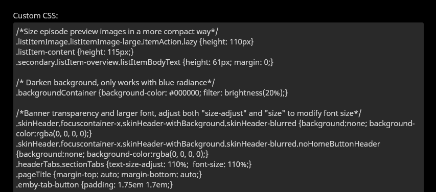
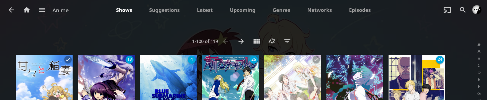
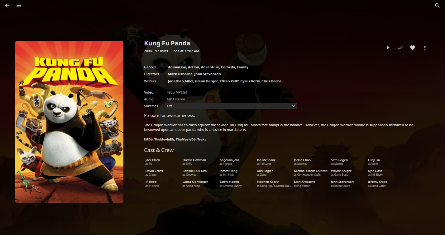
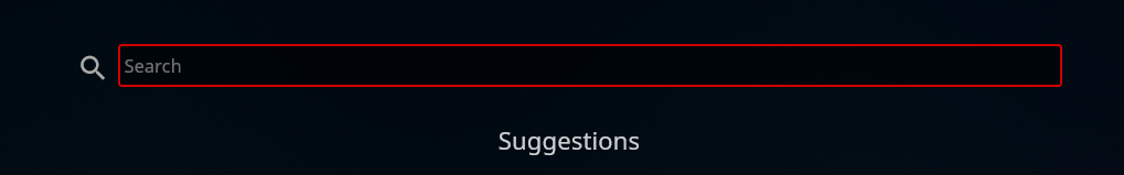
Enlarge Tab Buttons
Enlarges the tab buttons, suggested, genres, etc. By default they are really tiny, especially on mobile.
/* Adjust both "size-adjust" and "size" to modify size */
.headerTabs.sectionTabs {
  text-size-adjust: 110%;
  font-size: 110%;
}
.pageTitle {
  margin-top: auto;
  margin-bottom: auto;
}
.emby-tab-button {
  padding: 1.75em 1.7em;
}
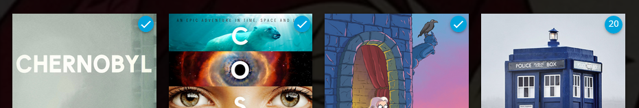
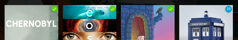
The enlarged tab buttons and transparent menu look like this:
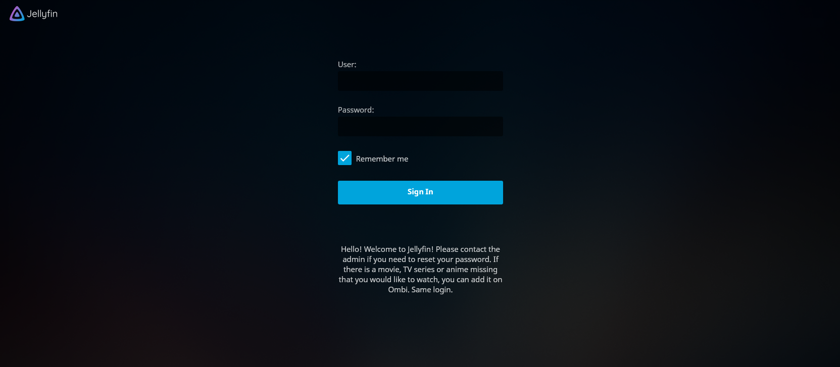
Minimalistic Login Page
This looks even better together with the transparent top menu!
/* Narrow the login form */
#loginPage .readOnlyContent,
#loginPage form {
  max-width: 22em;
}

/* Hide "please login" text, margin is to prevent login form moving too far up */
#loginPage h1 {
  display: none;
}
#loginPage .padded-left.padded-right.padded-bottom-page {
  margin-top: 50px;
}

/* Hide "manual" and "forgot" buttons */
#loginPage .raised.cancel.block.btnManual.emby-button {
  display: none;
}
#loginPage .raised.cancel.block.btnForgotPassword.emby-button {
  display: none;
}
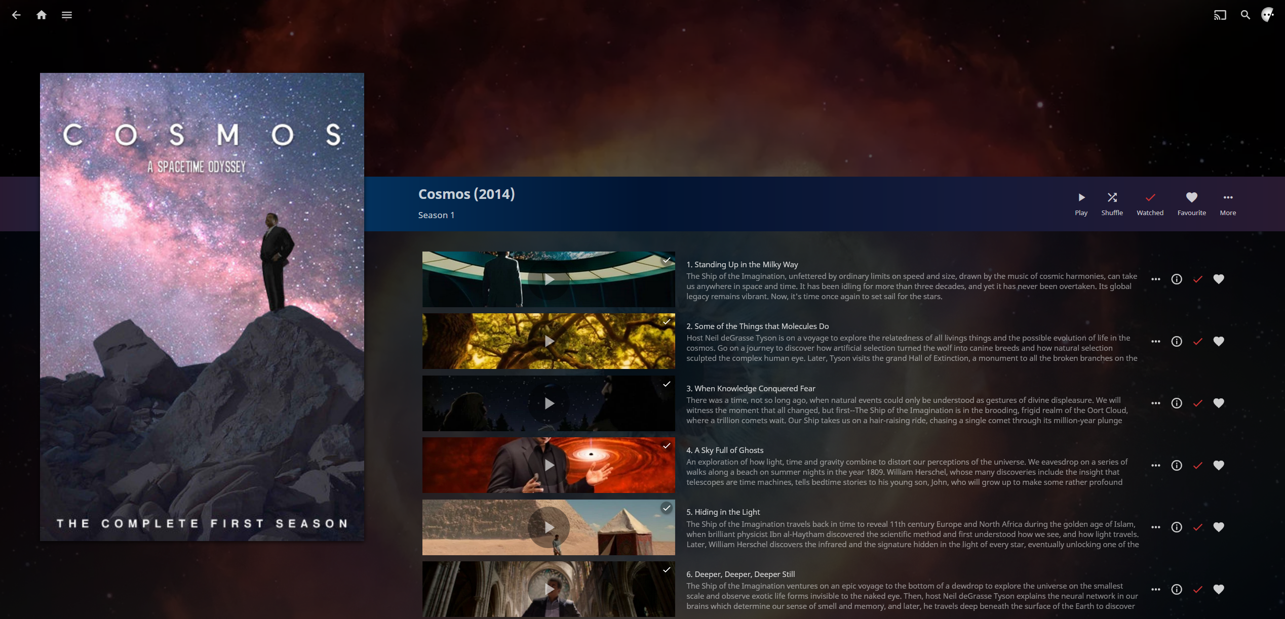
Stylized Episode Previews
The episode previews in season view are sized based on horizontal resolution. This leads to a lot of wasted space on the episode summary and a high vertical page, which requires a lot of scrolling. This code reduces the height of episode entries, which solves both problems.
/* Size episode preview images in a more compact way */
.listItemImage.listItemImage-large.itemAction.lazy {
  height: 110px;
}
.listItem-content {
  height: 115px;
}
.secondary.listItem-overview.listItemBodyText {
  height: 61px;
  margin: 0;
}
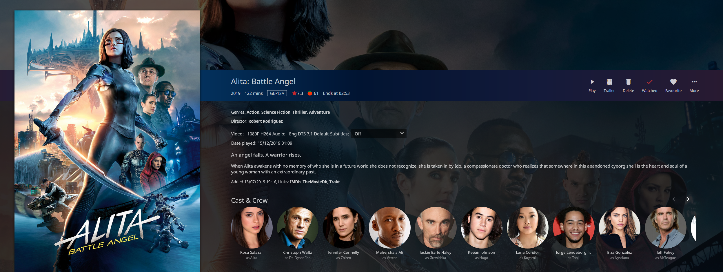
Stylized and Smaller Cast & Crew Info
This will drastically change the style of cast info into something very similar to how Plex approaches it. This override will lead to somewhat smaller thumbnails, and also works with all themes.
/* Shrink and square (or round) cast thumbnails */
#castContent .card.overflowPortraitCard.personCard.card-hoverable.card-withuserdata {width: 4.2cm !important; font-size: 90% !important;}
#castContent .card.overflowPortraitCard.personCard.card-withuserdata {width: 4.2cm !important; font-size: 90% !important;}

/* Correct image aspect ratio behavior, set border-radius to zero for square tiles */
#castContent .cardContent-button.cardImageContainer.coveredImage.cardContent.cardContent-shadow.itemAction.lazy {background-size: cover; !important; border-radius: 2.5cm;}
#castContent .cardContent-button.cardImageContainer.coveredImage.defaultCardBackground.defaultCardBackground1.cardContent.cardContent-shadow.itemAction {background-size: cover; !important; border-radius: 2.5cm;}
#castContent .cardContent-button.cardImageContainer.coveredImage.defaultCardBackground.defaultCardBackground2.cardContent.cardContent-shadow.itemAction {background-size: cover; !important; border-radius: 2.5cm;}
#castContent .cardContent-button.cardImageContainer.coveredImage.defaultCardBackground.defaultCardBackground3.cardContent.cardContent-shadow.itemAction {background-size: cover; !important; border-radius: 2.5cm;}
#castContent .cardContent-button.cardImageContainer.coveredImage.defaultCardBackground.defaultCardBackground4.cardContent.cardContent-shadow.itemAction {background-size: cover; !important; border-radius: 2.5cm;}
#castContent .cardContent-button.cardImageContainer.coveredImage.defaultCardBackground.defaultCardBackground5.cardContent.cardContent-shadow.itemAction {background-size: cover; !important; border-radius: 2.5cm;}
#castContent .cardScalable {width: 3.8cm !important; height: 3.8cm !important; border-radius: 2.5cm;}
#castContent .cardOverlayContainer.itemAction {border-radius: 2.5cm;}

/* Center the mouseover buttons */
#castContent .cardOverlayButton-br {bottom: 4%; right: 15%; width: 70%;}
#castContent .cardOverlayButton.cardOverlayButton-hover.itemAction.paper-icon-button-light {margin:auto;}
Pictureless Cast & Crew
#castContent .card.overflowPortraitCard {
  width: 4.2cm;
  font-size: 90%;
}

#castContent .personCard {
  width: auto;
}

#castContent .personCard .cardBox {
  margin-bottom: 0px;
  margin-right: 0px;
}

#castContent {
  flex-wrap: wrap;
  max-height: 9.75em;
}

div.personCard > :first-child > :first-child {
  display: none;
}

.itemDetailPage .cardText {
  text-align: left;
}

.itemDetailPage .textActionButton {
  text-align: left;
}
Custom Background Color
.backgroundContainer,
.dialog,
html {
  background-color: #0fd0d0;
}
Darken the Background
This darkens the background on Blue Radiance and Purple Haze, edit the percentage depending how dark you want it. Lower is darker.
/* Darken background, only works with blue radiance */
.backgroundContainer {
  background-color: #000000;
  filter: brightness(50%);
}
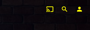
Right Header Color
This modifies the colors of the cast, search and user buttons in the top right.
.headerRight {
  color: yellow;
}
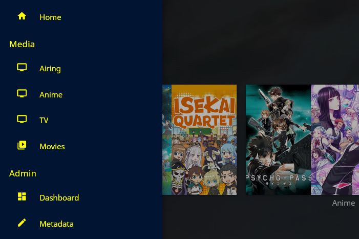
Console Panel Custom Color
Modifies the color of the left menu panel.
.mainDrawer-scrollContainer {
  color: yellow;
}
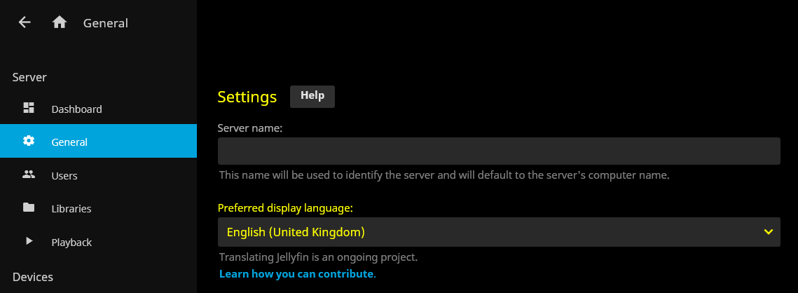
General Page Custom Color
.dashboardGeneralForm {
  color: yellow;
}
Custom Border Color
This will change the border color for text fields and drop-down menus.
.emby-input,
.emby-textarea,
.emby-select {
  border-color: #d00000;
}
This will affect the border color of highlighted (selected) text fields and drop-down menus.
.emby-input:focus,
.emby-textarea:focus,
.emby-select-withcolor {
  border-color: #ffffff !important;
}
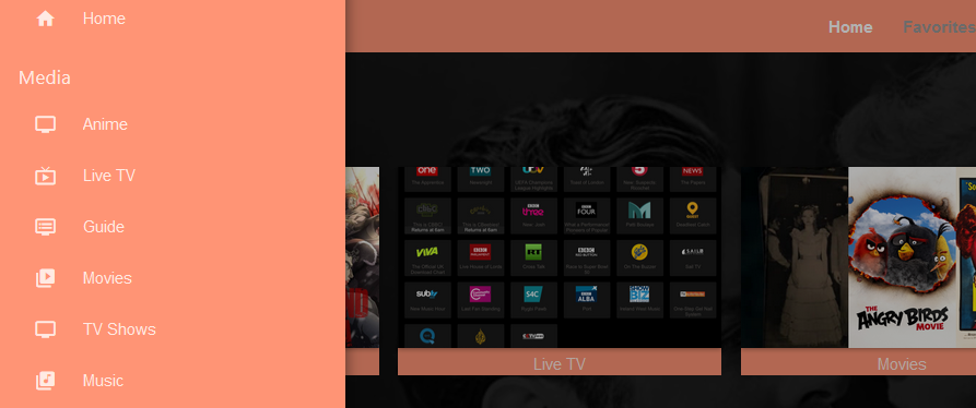
Full Header Tweak
.skinHeader,
.mainDrawer,
.emby-input,
.emby-textarea,
.emby-select,
.navMenuOption-selected,
.cardBox,
.paperList {
  background: #ff9475;
}
Disable Image Carousel for Libraries
This will make it so libraries and media fit neatly onto the homepage with no left to right scrolling required.
@media all and (min-width: 50em) {
  .homePage .emby-scroller {
    margin-right: 0;
  }
  .homePage .emby-scrollbuttons {
    display: none;
  }
  .homePage .itemsContainer {
    flex-wrap: wrap;
  }
}
Shift Scroller Buttons
.emby-scrollbuttons {
  position: absolute;
  left: 0;
  top: 0;
  width: 100%;
  height: 100%;
  padding: 0;
  justify-content: space-between;
  pointer-events: none;
}

.emby-scrollbuttons-button {
  pointer-events: initial;
}
"Hotdogs and Catsup" Color Theme Example
An example of a color theme.
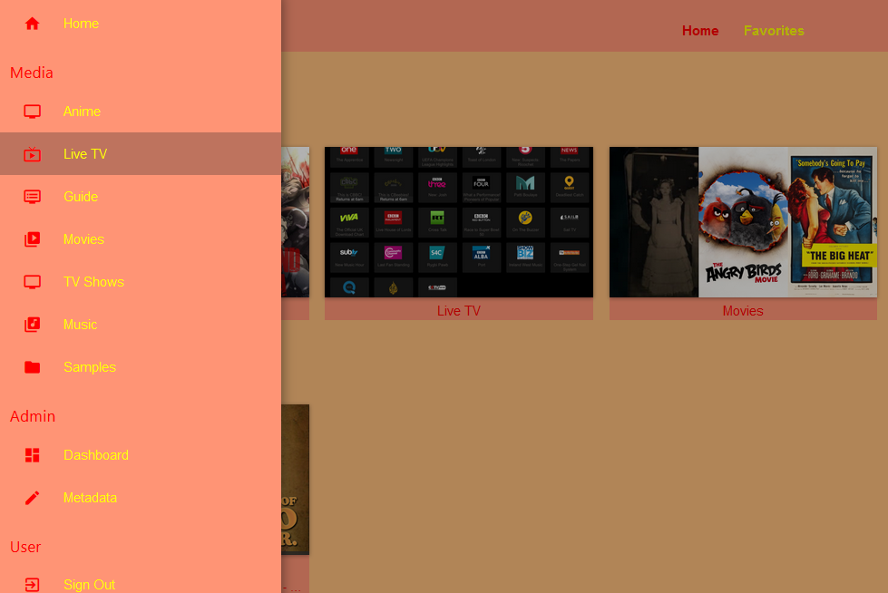
.skinHeader,
.mainDrawer,
.emby-input,
.emby-textarea,
.emby-select,
.navMenuOption-selected,
.cardBox,
.paperList {
  background: #ff9475;
}

.emby-input,
.emby-textarea,
.emby-select {
  border-color: #fdbe7d;
}

.backgroundContainer.withBackdrop,
.backdropContainer,
.backgroundContainer {
  background: #fdbe7d;
}

#myPreferencesMenuPage .listItemBodyText,
.emby-tab-button[data-index='0'],
#myPreferencesMenuPage > div > div > div > a:nth-child(odd),
.button-submit,
.mainAnimatedPage *:nth-child(odd),
.dashboardGeneralForm *:nth-child(odd),
.mainDrawer-scrollContainer *:nth-child(odd),
.headerRight *:nth-child(odd) {
  color: red;
}

#myPreferencesMenuPage .listItemIcon,
.emby-tab-button[data-index='1'],
#myPreferencesMenuPage > div > div > div > a:nth-child(even),
.mainAnimatedPage *:nth-child(even),
.dashboardGeneralForm *:nth-child(even),
.mainDrawer-scrollContainer *:nth-child(even),
.headerRight *:nth-child(even) .cancel {
  color: yellow;
}
Floating Now Playing Controls
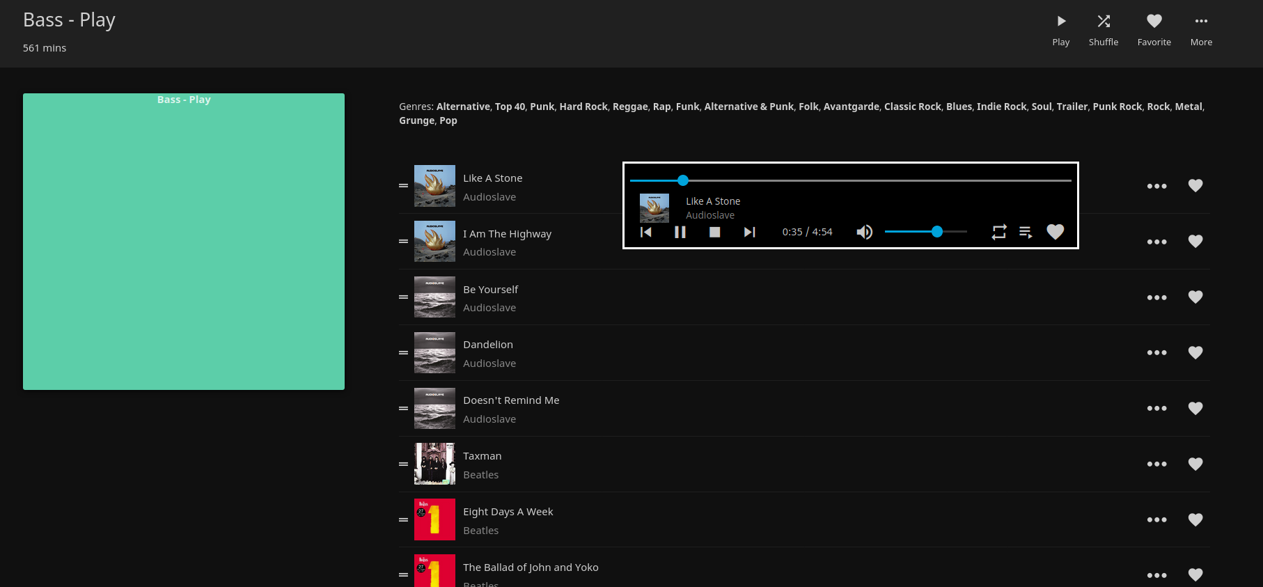
/* fixed height for the bottom row */
:root {
  --element-fixed-top: 95px;
}

/* Now playing bar in the footer */
.nowPlayingBar {
       width: 650px;
       z-index: 10;
       position: fixed;
       top: 300px;
       height: 120px;
      border-style: solid;
      border-color: white;
      background-color: black;
      margin-left: 50%;
}

/* Only child of nowPlayingBar */
.nowPlayingBarTop {
     height: 5px !important;
     max-width: 500px
     top: 10px;
}

/* Song progress seekbar */
.nowPlayingBarPositionContainer {
     position: relative;
     top: 1.0em !important;
}

/* Container that holds album thumbnail, artist and album name */
.nowPlayingBarInfoContainer {
     position: fixed !important;
     left: 12px;
     top: 34px;
     height: 60px;
     width: 1100px;
}

/* Holds the next, previous track, play/pause, next and time elements */
.nowPlayingBarCenter {
     position: relative !important;
     left: 32px;
     top: var(--element-fixed-top);
     min-width: 500px;
}

/* Hold mute, volume slider container, repeat, favorite and remote control buttons */
.nowPlayingBarRight {
     width: 402px !important;
     left: -60px;
}

/* Mute button */
.muteButton {
    position: relative;
    top: var(--element-fixed-top);
}

/* Volume slider */
.nowPlayingBarVolumeSliderContainer {
     position: relative;
     left: -4px;
     top: var(--element-fixed-top);
}

/* Toggle repeat */
.toggleRepeatButton {
     position: relative !important;
     left: -20px;
     top: var(--element-fixed-top);
}

/* Favorite */
.nowPlayingBarUserDataButtons {
     position: relative;
     left: -4px;
     top: var(--element-fixed-top);
}

/* Remote control */
.remoteControlButton {
     left: -110px;
     top: var(--element-fixed-top);
}
Change Icon Pack
You can choose between Material Icons (Icon Pack used by Jellyfin) and Fontawesome icons. Material Icons:
-
Outlined:
@import url('https://cdn.jsdelivr.net/gh/prayag17/Jellyfin-Icons/Outline.css'); -
Rounded:
@import url('https://cdn.jsdelivr.net/gh/prayag17/Jellyfin-Icons/round.css'); -
Sharp:
@import url('https://cdn.jsdelivr.net/gh/prayag17/Jellyfin-Icons/Sharp.css');
Fontawesome Icons:
-
Solid:
@import url('https://cdn.jsdelivr.net/gh/prayag17/Jellyfin-Icons/Font%20Awesome/solid.css'); -
Regular:
@import url('https://cdn.jsdelivr.net/gh/prayag17/Jellyfin-Icons/Font%20Awesome/regular.css'); -
Light:
@import url('https://cdn.jsdelivr.net/gh/prayag17/Jellyfin-Icons/Font%20Awesome/light.css'); -
duotone:
@import url('https://cdn.jsdelivr.net/gh/prayag17/Jellyfin-Icons/Font%20Awesome/duotone.css');
Community Links
Some links to places where custom CSS has been discussed and shared!
Community Posts
Keep in mind that these posts may have been made under previous versions of Jellyfin. Some of these tweaks listed in these guides may not work anymore!
- Custom CSS Guide
- "But wait, there is more Custom CSS!"
- Customizable Plug n' Play CSS for Jellyfin
- Easy Jellyfin custom CSS
- Custom CSS - updated for 10.5.0
- Sharing even more custom CSS (and some fixes to previous stuff)
- Posting my Jellyfin Custom CSS
Community Themes
- Ultrachromic - A custom theme for Jellyfin mediaserver created using CSS overrides
- JellySkin - Vibrant Jellyfin theme with a lot a animations
- JellyFlix - The Best Netflix Clone for Jellyfin
- Jellyfin Netflix Dark - The Best Netflix Dark Theme for Jellyfin Around!
- Dark and Green - A Emby like night mode skin
- Hint of Green
- Scyfin - A modern Jellyfin theme